9 Strategies to Generate More Leads from Website Visitors


Getting leads from your website isn’t just about catchy pop-ups or free downloads anymore. It’s about creating a real, human experience that makes visitors feel understood and confident about taking the next step. Whether you’re running a small business or managing a growing team, the foundations of lead generation haven’t really changed. It’s still about earning attention, building trust, and making conversion effortless.
In this guide, we’ll walk through nine practical strategies you can use right now to turn website visitors into real leads. These approaches are rooted in psychology, marketing automation, and user experience, designed for how people actually browse, think, and buy.

1. Start With Value: Offer Smart Lead Magnets That Solve a Real Problem
Let’s start with this: people don’t want vague promises or “free ebooks” that feel generic. They want something that immediately makes their life easier. Lead magnets still work, but only if they’re focused, relevant, and instantly useful.
How to create better lead magnets:
- Focus on one specific, solvable problem.
- Make it short, actionable, and genuinely helpful.
- Automate delivery through your CRM.
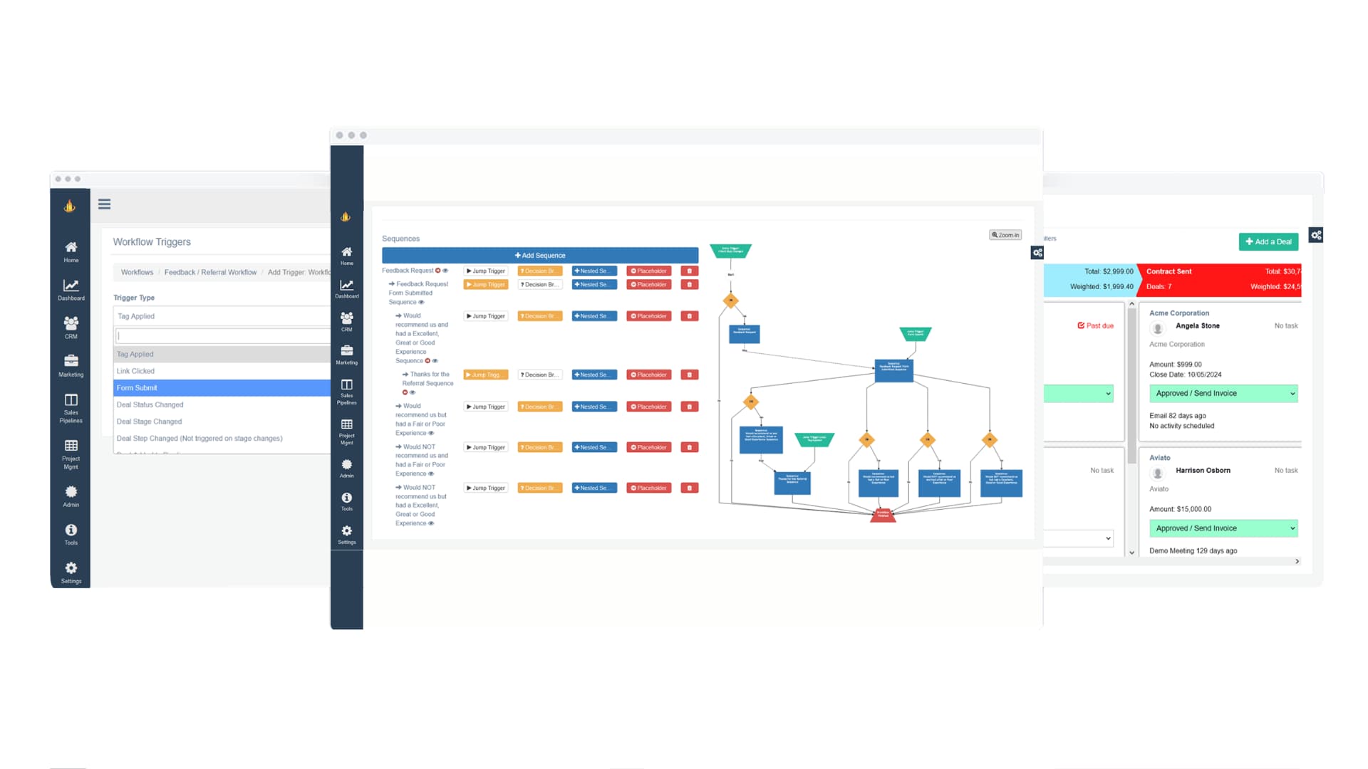
- Connect your follow-ups using marketing automation for a smoother experience.
To give you an idea of what works best, here are a few types of lead magnets that consistently perform well across industries. Each offers a slightly different benefit, depending on your audience and goals, so consider which would add the most value to your visitors.
Want to take your lead magnets from good to great? Make sure the experience itself feels effortless. A well-designed, easy-to-follow resource creates trust before you’ve even asked for anything in return. Clean formatting, clear headings, and simple visuals go a long way in making your offer feel credible and worthwhile.
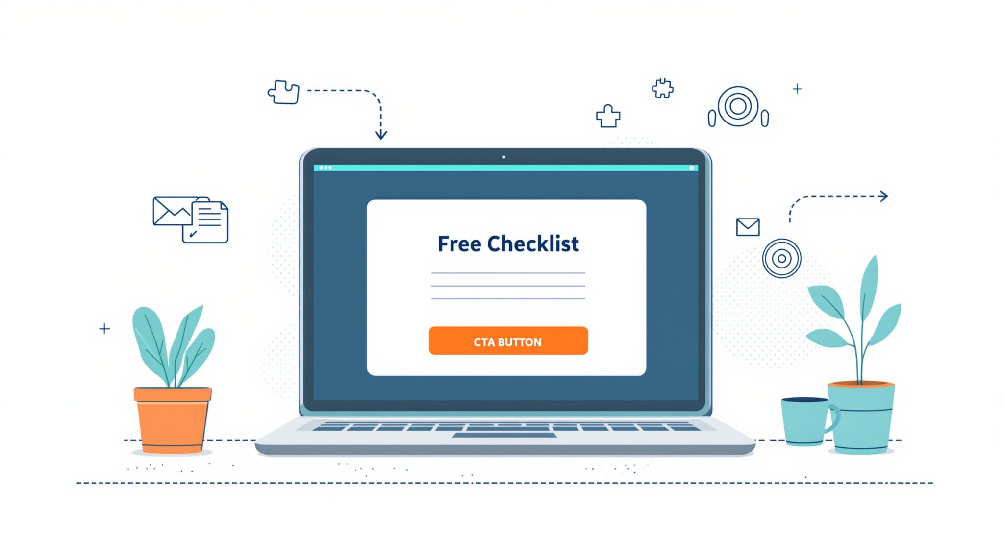
You can also make your magnet more irresistible by focusing on results. Instead of saying “Free Checklist,” try “Free Checklist to Audit Your Sales Process in 10 Minutes.” That small tweak sets clear expectations and instantly makes the benefit tangible.
Key steps to enhance engagement:
- Match your offer to a specific stage in the customer journey (awareness vs. decision).
- Use action-oriented titles that focus on results.
- Add a quick video or mini explainer for visual learners.
- Follow up automatically with your workflow automation system to reinforce value.
Still not sure where to start? Look at your most-read blogs or most-asked questions, your audience is already telling you what they need. The best lead magnets often grow naturally out of your existing content.
2. Build Trust Through Consistent, Helpful Content
Here’s the truth: people rarely convert the first time they visit your site. Trust takes time and consistency. When you show up with helpful, practical content that genuinely helps people solve problems, you become a go-to resource instead of just another option.
Practical trust-building tips:
- Share content that connects real problems to actionable outcomes.
- Keep your tone and visuals consistent across every channel.
- Link related content to help readers explore further.
Consistency isn’t just about frequency, it’s about rhythm. Every article, email, or post should feel like part of the same story. You’re building familiarity with your audience over time, one small, valuable moment at a time.
Tips to maintain credibility and engagement:
- Plan around themes. Stick to one focus area per month so your audience knows what to expect.
- Cross-link your work. Help people discover related resources while keeping them on your site longer.
- Mix it up. Alternate between in-depth guides, short posts, and Q&As to keep things fresh.
- Keep it current. Update old content with new insights to stay relevant.
According to Edelman’s Trust Barometer, over 60% of people trust companies that provide educational, transparent content. So focus on teaching, not selling. When you consistently share knowledge, you earn attention and loyalty.
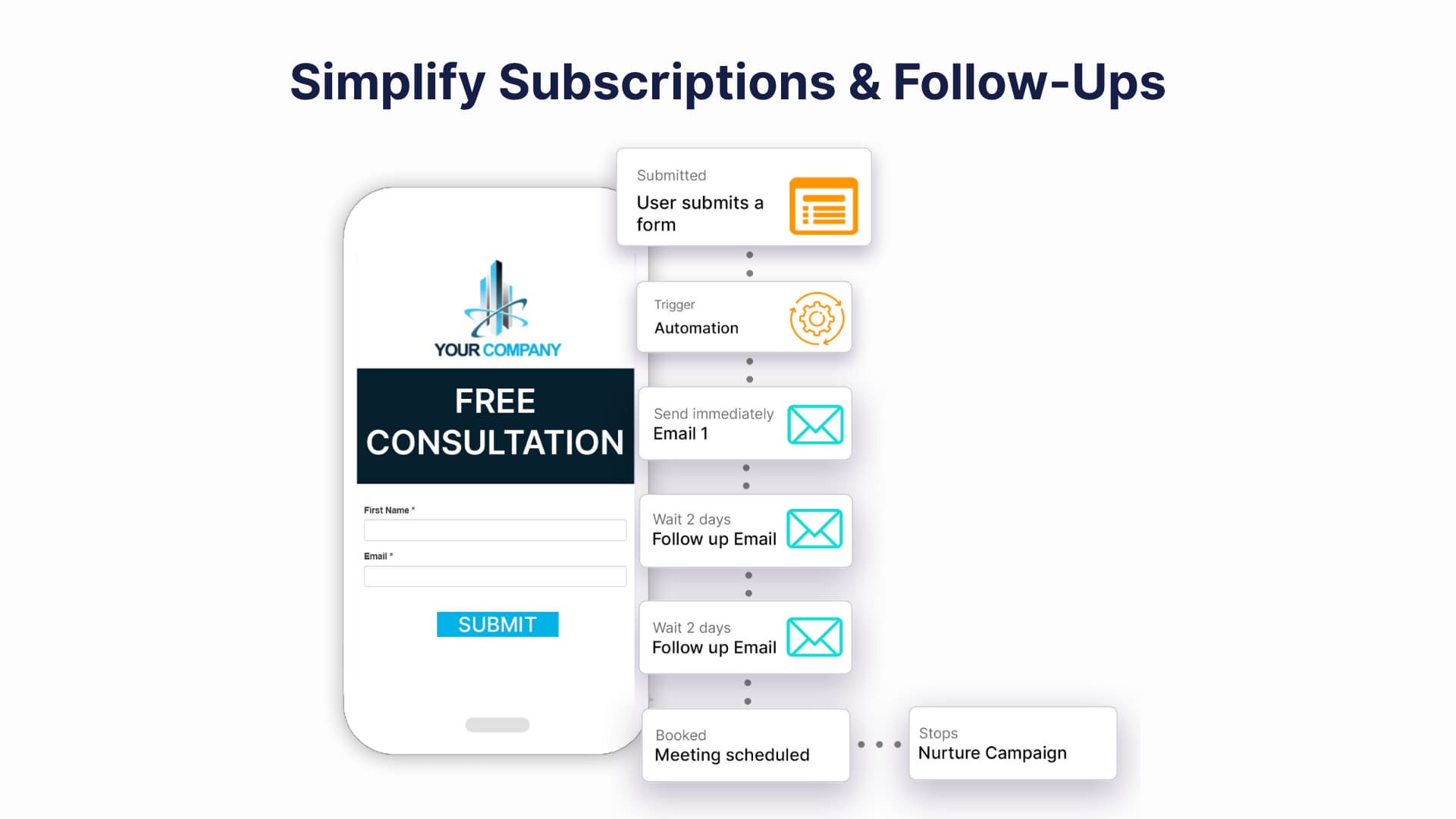
3. Simplify Subscriptions and Follow-Ups
If your newsletter or blog subscription is buried at the bottom of your page, you’re leaving leads on the table. People actually want to stay connected, you just need to make it easy.
To improve subscriptions:
- Keep forms short (three fields or fewer).
- Write clear, honest copy like “No spam. Just strategy.”
- Offer something small but relevant in exchange, like a free checklist, to the solution your checklist provides.
Follow-up workflow best practices:
- Send your first email right away, while interest is fresh.
- Keep a steady, predictable rhythm.
- Segment follow-ups by behavior using your CRM contact management system.
Now, let’s talk about how your sign-up experience feels. A long, confusing form? That’s an instant turnoff. Keep it simple, show what people can expect, and deliver right away. You can even include a preview of your newsletter so they know what they’re signing up for.
Common mistakes to avoid:
- Asking for too much info (like birthdays or job titles).
- Using bland CTAs like “Submit.”
- Sending inconsistent or irrelevant follow-ups.
Create a short welcome series to set the tone and expectations. Show readers you value their time. You can even automatically adjust frequency based on engagement, sending more to active readers and less to quieter ones. When you balance automation with empathy, you build relationships that last.
4. Capture Intent With Smart Popups and Exit Prompts
Pop-ups get a bad reputation, but the truth is, they can be incredibly effective when done right. The key is in how and when you use them. With thoughtful timing and the right message, a well-placed pop-up can grab attention just when a visitor is most interested. When it comes to pop-ups or exit prompts, timing and relevance make all the difference.
Instead of showing them randomly, trigger them based on how people behave on your site. Match what you’re offering to what the visitor is doing, like showing a guide related to the article they’re reading. And keep your designs clean, clear, and easy to close so they feel like a natural part of the experience, not an interruption.
According to Nielsen Norman Group, poorly timed pop-ups can push people away, but smartly triggered ones can actually boost engagement. A well-placed exit pop-up offering a resource or discount can give users a reason to stay connected.
Pro Tip: Try experimenting with different triggers in your conversion optimization tool. For example, test showing pop-ups after 60 seconds or once someone scrolls 80% of a page. You’ll quickly see what feels natural to your audience.
If you’re ready to experiment with pop-ups but want tools that make it easy and effective, here are a few great options to start with. Each one offers flexible targeting, smart triggers, and integrations that can help you fine-tune your timing and message.
Suggested tools:
- OptinMonster – Ideal for creating behavior-based pop-ups and exit intent offers.
- Hello Bar – Great for simple, non-intrusive top bars and slide-ins.
- Wisepops – A powerful pop-up and on-site messaging tool that helps you engage visitors and capture leads with smart targeting options.
These platforms help you design pop-ups that feel natural and intentional rather than distracting. Try a few out to see which one fits your website’s style and audience best.
5. Humanize Conversions With Live Chat or Guided Support
Think of live chat as your virtual handshake. It’s often the first real interaction people have with your team, and that first impression matters.
Effective chat setup checklist:
- Train agents to start with open-ended questions.
- Personalize scripts for each page type.
- Track response times and satisfaction rates.
Forrester Research found that visitors who use live chat are nearly three times more likely to convert. It makes sense, people get answers faster and feel like they’re talking to someone who actually listens.
Here’s a tip: respond fast. Aim to reply to new chats within 60 seconds or less. Quick responses show attentiveness and keep conversations flowing naturally. And if you can, sync your chat data with your CRM so your team always has context.
Tips to make your chat feel human:
- Match tone to intent, friendly for readers, direct for buyers.
- Reply fast, speed builds trust.
- Track recurring questions to improve FAQs or content.
At the end of the day, chat is about connection. People don’t want scripted replies. They want genuine help. When visitors feel heard and guided in real time, they’re more likely to stick around.

6. Design for Every Device, Every Journey
We all know mobile matters, but designing for every device means more than just making things “responsive.” It’s about creating experiences that feel smooth, no matter where or how people visit your site.
Mobile UX essentials:
- Keep forms short.
- Make CTAs easy to tap.
- Ensure pages load in under three seconds.
Most people move between devices before making a decision. Maybe they find you on their phone, then revisit on a laptop later. So consistency matters. Keep your design simple, your visuals aligned, and your experience familiar across all screens.
Checklist for better cross-device experiences:
- Optimize load times with smaller images and cleaner code.
- Keep design elements consistent across devices.
- Use analytics to see where people drop off.
- Test your site like a visitor, across mobile, tablet, and desktop.
Accessibility matters, too. Alt text, contrast, and keyboard navigation aren’t just checkboxes, they’re part of what makes your site welcoming and trustworthy. When your site feels intuitive and easy to use anywhere, it quietly builds credibility with every click.
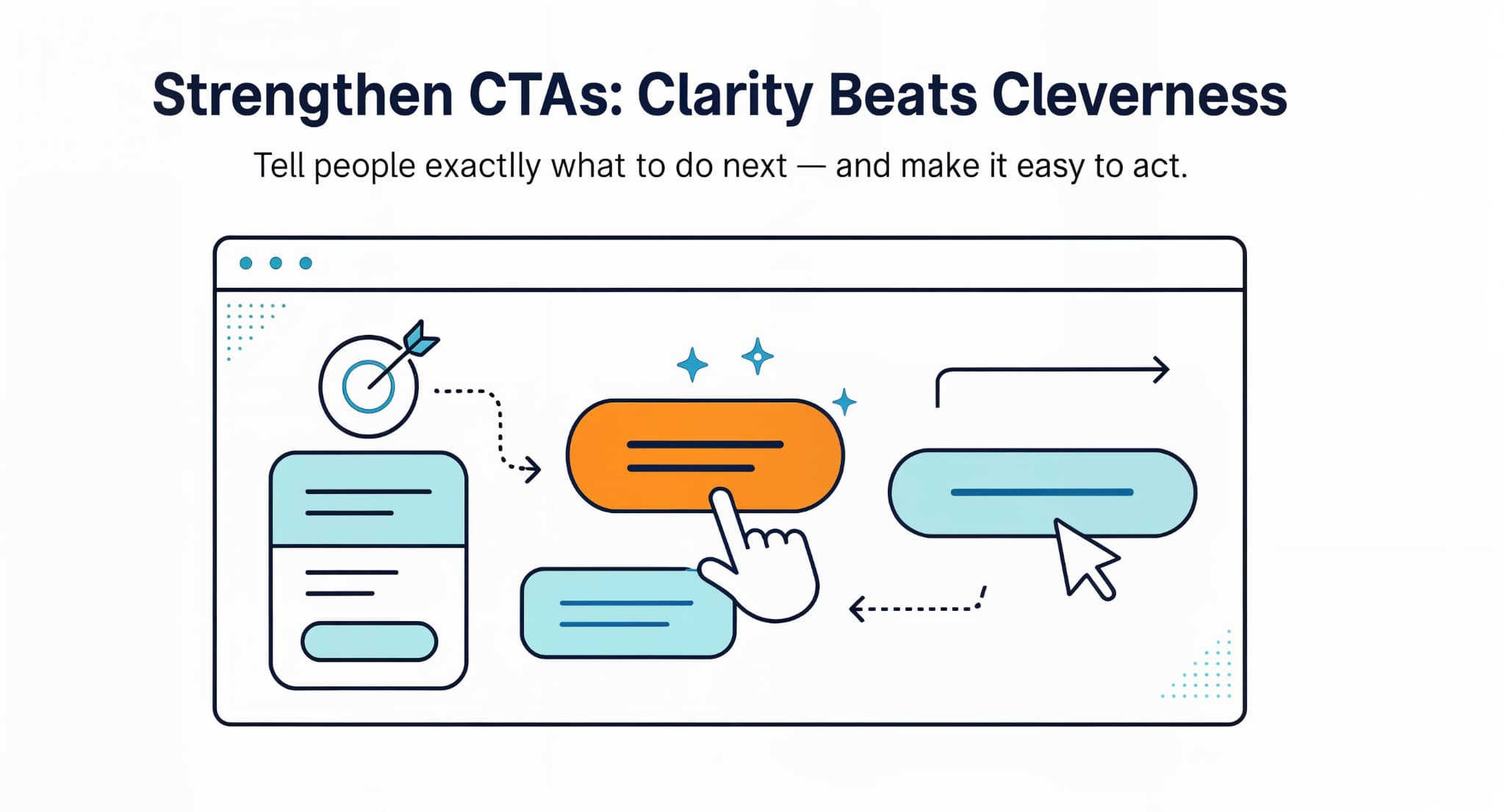
7. Strengthen CTAs: Clarity Beats Cleverness
Here’s where many websites slip up, being clever instead of clear. A good CTA doesn’t try too hard,. It simply tells people what to do next.
When it comes to calls to action, clarity always beats cleverness. Use strong, straightforward verbs like “Download,” “Start,” or “Join” so people know exactly what will happen next. Make sure your CTAs communicate a clear result, like “Get my 5-minute audit,” instead of vague commands. And don’t hide them at the bottom of the page. Place them naturally throughout your content where readers are most likely to be ready to act because the best CTAs feel like a natural next step, not a hard sell.
Your CTA isn’t just a button, it’s a moment of decision. It bridges curiosity and action. When visitors know exactly what they’re getting, they’re more likely to click without hesitation.
Ways to create stronger CTAs:
- Use first-person phrasing, “Show Me My Report” feels personal.
- Combine urgency (“Start Today”) with reassurance (“No credit card needed”).
- Use small, supportive CTAs (“See How It Works”) to build toward bigger ones (“Book a Demo”).
Color, placement, and timing make a big difference, too. Keep buttons distinct but not overwhelming. Place them near sections where readers naturally feel ready to act.
When testing, don’t just track clicks, watch behavior. Use website heatmap tracking tools to understand what’s driving action. Sometimes, a single word change can shift the whole outcome.
8. Create Dedicated Landing Pages for Each Campaign
Each campaign deserves its own stage. A dedicated landing page gives visitors one clear path forward, no distractions, no confusion. When you’re building a landing page, think simplicity and focus. Start by giving visitors one clear reason to stay and take action.
Keep your message centered on a single goal or offer, remove any links that could distract from it, and use headlines that speak directly to what your audience wants. Add strong visuals and proof to make your promise feel credible and tangible, like testimonials, quick stats, or images that show real results. The simpler and more focused your page, the more naturally it guides visitors toward conversion.
Unbounce found that single-focus landing pages can double or even triple conversions. And your reporting system can help you track what works best.
Q&A: How long should your landing page be?
Keep offers short concise and to the point. For higher-value offers, like consultations, take the time to tell the story and include proof or testimonials.
Landing Page Optimization Tips:
- Lead with a headline that answers “What’s in it for me?”
- Show social proof or testimonials early.
- Break information into short, readable sections.
- Test variations to see what your audience connects with.
Think of each landing page as a mini conversation. The clearer and more relevant it feels, the more likely people are to act.
9. Close the Loop With Automated Nurture Sequences
You’ve done the hard part, you got the lead. Now it’s about what happens next. Great follow-up sequences turn interest into action by keeping the conversation going naturally. When setting up a nurture sequence, think of it as guiding a conversation rather than sending a string of automated messages.
Start by delivering something valuable right after someone signs up so they feel appreciated and confident they made the right choice. Then, follow up with useful, educational content that builds on that first impression and keeps the connection alive. Finally, pace your emails thoughtfully by spacing them out, perhaps one after a day, another after three days, and another a week later so they feel natural and never overwhelming.
A well-built nurture flow feels personal. It doesn’t flood inboxes, it offers useful insights at just the right moment. Think of it as a slow conversation that builds trust and familiarity.
Tips for better nurture sequences:
- Segment leads based on intent (download vs. webinar).
- Add behavioral triggers (e.g., re-engagement emails).
- Mix it up with videos, short emails, and helpful links.
- Ask for feedback to stay relevant.
Tie your emails to your CRM to personalize each touchpoint. When automation feels natural, it doesn’t feel like marketing, it feels like good timing.